Archive for the 'Exhibitions' Category


The Public City exhibition at the Building Centre is a collection of recent public space projects in London. The exhibition itself was slightly upstaged by the huge scale model of London in the foyer of the centre. The model is incredibly detailed and beautifully constructed from acrylic and includes the proposed Olympic developments and other landmark structures. The simple colour scheme and knee-high presentation make it easy to understand and a pleasure to study, in fact I think they shot themselves in the foot because I spent more time looking at the model than the exhibition.

The show itself was very interesting and presented a wide variety of projects that gave a good overall picture of London’s style. The boards were a bit overcrowded as they had tried to pack so much information into such a small room and each project only had a limited amount of space to be displayed. Fortunately the organizers had also produced a beautiful little booklet that can be taken away and studied at leisure. I really think this is a great idea for an exhibition like this because there was too much to digest in one visit and the booklet is ideal to have lying around and even keep for future reference.
It was useful to see how each design team chose to present their work and I suppose the restrictions on size helped to push the quality of this. It was good to see hand drawing alongside the usual photomontage, photography and models but it really underlined how powerful 3D rendering can be for representing ideas. Obviously the budget for visualization on some of these projects was immense but it was reflected in the quality of the 3D graphics.

My pick of the show is the work by Space Syntax on the London Pedestrian Routemap. I think the concept is brilliant and certainly would have found it useful when I first moved to London as it took some time to get my head around the layout and especially how easy it is to walk around. I also like the way they have used the graphic quality of the tube map to promote walking as an equally viable mode of transport.

Another beautiful map by Space Syntax showing street use intensity in London.

Until March this year the British Library is giving us the unique opportunity to look at a huge collection of historic London maps in one exhibition. Being such a fundamental part of our understanding of the space around us maps are incredibly important in landscape architecture. They are important not only to record but also to analyse and interpret our surroundings and can be tailored to display detailed and specific information for different uses. It is this variety in cartographic techniques that intrigues me the most and this is a great opportunity to see the development over the years.
The exhibition was laid out in a chronological order starting with the oldest first and progressing through the development of the city. There was a massive variety in the purpose of the maps, which shows how the same skills can be used for entirely different reasons. Most maps were simply recording the physical extent of the city at that particular time but others had obvious religious bias and focused on churches and cathedrals. One that I found interesting was a map of the religious demographic of East London, created by the government in 1900. Its focus was the Jewish community and clearly showed the areas they lived in. I’m not sure exactly why this map was drawn but I’m sure such a map wouldn’t be considered ‘politically correct’ today.

The time and effort that went into these pieces is staggering, I can’t even begin to imagine the patience required to draw a map of London on one piece of paper without the computerised functions we take for granted today. Also as many were created before the development of printing only one copy was produced making them incredibly valuable.
One other unusual feature of the older maps is the cartographer’s interpretation of scale and the use of different drawing techniques. The maps would be laid out in plan but individual elements could be drawn in perspective, from various angles. These days we are used to everything being in mathematically correct scale but before the days of GPS and laser range finders cartographers had to interpret scale themselves. It’s for this reason that many old maps have a comic book quality in which scale often related to an elements perceived importance.
It is this type of human input that I feel is missing from many of our modern maps which are simply correct and uniform. Having said that I really enjoy the modern simplified maps that cut away unnecessary information and leave an easily understood graphic. The obvious piece to mention is Harry Beck’s London tube map that has become an iconic graphic for the city.
Overall I thought the exhibition was good, the material was very interesting but the presentation left a little to be desired. There wasn’t really enough room to get a decent look at the exhibits because it was so busy and the low lighting didn’t give the maps the presentation they deserved. I realise that some compromise had to made to protect the delicate paper but these are just as good as any other artwork and should be celebrated not hung in a small dingy room.

Well, if you’re going to visit the Tate Modern at the moment it would simply be rude not to have a go on Carsten Holler’s latest addition to the turbine hall. Usually I’m quite critical of ‘modern art’ especially when it comes to putting everyday objects in an art gallery but this is exceptional. It’s the perfect installation for the massive space of the turbine hall and not only does it look brilliant but it’s also great fun. I really liked the last exhibit in the Unilever series, Rachel Whiteread’s white boxes, but the interaction with this piece sets it apart and the Tate should be commended for actually allowing it and not getting put off by the inevitable wall of red tape.
UBS Openings: Photography From The UBS Art Collection
Published December 20, 2006 Exhibitions Leave a Comment
The UBS collection at Tate Modern is an exciting collection of contemporary photographs that range in style and content. My favourite image is by Andreas Gursky and is supermarket shelves in an American 99 cent shop. It is obviously a comment on American consumerism but apart from the statements about society it’s an amazing image that is worthy of the massive (3/2m) space it occupies in the gallery. The photography in this exhibition is at an entirely different level to what we are used too. It is very inspirational to see the media being used in such an artistic and creative way in a society where almost everyone has a camera in their pocket and we take millions of mediocre photos every day.

On the Southbank was an exhibition called the Lomo wall it is a wall covered in 6/4-inch photos taken with a Russian camera known as a lomo. The lomo is a simple and rugged camera that was designed to be used by the KGB in low light conditions. People discovered that using slide film, especially old and out of date film produced amazingly rich and saturated images. Now there is a community of people interested in lomo photography and a website dedicated to it http://www.lomography.com .
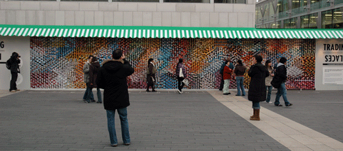
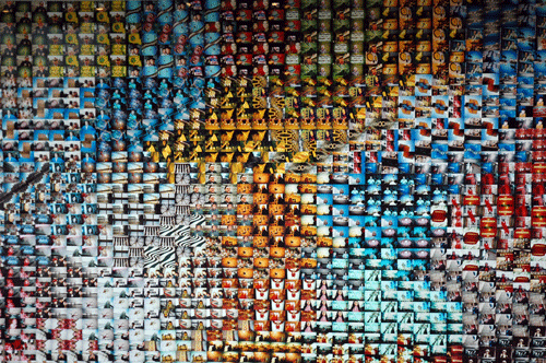
The exhibition on the Southbank was a collection of 4000 images taken in the Lower Marshes area of Waterloo and is titled trading Places. There is an interactive audio feature that plays recordings of resident’s memories and poetry if viewers press certain points on the wall. This installation is beautiful, not only are the photos stunning in themselves but their layout creates amazing patterns if you stand back from the wall.